All Images Shown Belong Solely to Rendez Padgett Unless Otherwise Stated. Unauthorized Duplication or Reproduction of Artwork Prohibited.
Monday, December 17, 2012
scratchboard self portrait
Here's a recent self portrait done on scratchboard. I gave this same assignment to my students at the Governor's School for the Arts, and told them I would do the same project with them. A lot of my students had never done scratchboard work before so they were very intimidated. I got them to break the ice and overcome their "deer in the headlights stare" by doing several drawings on black paper with white chalk to get comfortable with the concept of "drawing the light". The first drawings they did were a little shaky, but I could tell the concept began to sink in. After that, I gave them a demo on how to light a portrait for reference, and then how to scratch into the clay board with different tools for a variety of marks and effects.
I remember in my Art classes I always wanted to see what my instructors/professors work looked like. If I had a figure drawing teacher, I wanted to see what their drawings looked like...painting teacher, I wanted to see their paintings, etc. So I definitely didn't want to negatively affect the confidence of my students by participating in the assignment, but rather teach them by "doing". I also told them up front that if they didn't want me to participate, I wouldn't, but they wound up doing an incredible job on the assignment and they all told me they liked that I did the project with them.
Monday, March 26, 2012
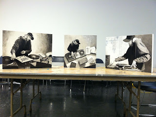
Au Courant Orchestra Series

Here they are ready to hang for the Governor's School for the Arts Faculty Show at the Hermitage Museum in Norfolk, VA. The show will run from May-June and will feature the faculty's work responding to the student's show "Tools of the Creative Mind". These were a blast to work on, a great break from working digitally...I got to knock the rust off of my traditional skills again. Enjoy!
Sunday, March 25, 2012
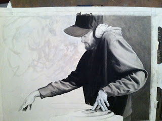
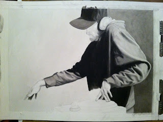
Au Courant Orchestra II (Breakdown)

Step 4: Final image. Went back and forth between graphite, acrylic washes, and popping highlights with white gouache. The final step was to cover the image with clear acrylic gloss medium because some areas were matte and some were glossy, doing this unifies the sheen of the image and helps, in my opinion, to punch up some of the lost contrast.

Step 3: Layout of background elements, and continuing to tweak the figure's values.

Step 2: Basic portrait and hands. Used graphite and charcoal to keep the rendering soft on the skin.

Step 1: Blocking in basic proportions and values of the figure. Used black acrylic for darkest dark value, ink wash, and graphite for mid tone values.
Wednesday, March 21, 2012
CMYK# 52
Wednesday, March 7, 2012
Figure Drawing in sketchbook

Did this last night at my figure drawing group. I had planned on painting on canvas for the 3 hour pose, but my painting materials were in my car...and my car is in the shop. So, I ended up using my toned sketchbook and various drawing/painting tools. I drew the figure in with charcoal and white chalk (using the tone of the paper to my advantage). Then I used a red prismacolor colored pencil to put some warmth back into the figure. I cut into the silhouette of the figure with acrylic paint and some ink. Then, I popped some highlights with white gouache. Had a lot of fun working on this.
Monday, February 27, 2012
Hunter S. Thompson
Friday, February 24, 2012
Figure drawing with scraps

Worked on this in my drawing class at Governor's School while my students were working on an hour pose. I found some discarded cardboard, charcoal, nupastel pieces, oil paint, and some ink so I thought I'd have some fun while my students cranked away. I set the model up with a mannequin from our storage closet, put a sport coat on him, and strapped a skull on him. I think this offered up a bit more of an interesting narrative for the students to work with that they maybe wouldn't have had with a single model.
Saturday, February 18, 2012
Wednesday, February 8, 2012
figure drooring
Monday, February 6, 2012
Year of the Dragon

Latest 2-pager for Richmond Magazine. This one was about the Chinese Year of the Dragon coinciding with the political candidates racing toward the election. The AD Steve Hedberg initially wanted a more daring illustration with the candidate's heads adorning dragon bodies, but once he saw the sketches, he decided it was too "creepy". So I reworked the sketch to a rough version of the final you see here and got the 'green-light' to go ahead. The political candidates I was asked to showcase were Democrat Tim Kaine and Republican George Allen. Instead of human heads, I went with the Democratic Donkey and the Republican Elephant as heads to the dragons. Thanks to Steve and all the guys at Richmond Magazine for keeping me busy!
Here's my initial "creepy" concept sketches.

Wednesday, February 1, 2012
Wednesday, January 4, 2012
Subscribe to:
Comments (Atom)


